Reupholstered Victorian Settee
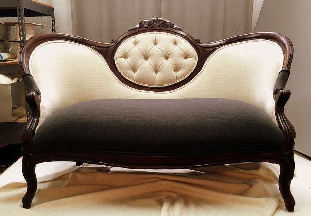
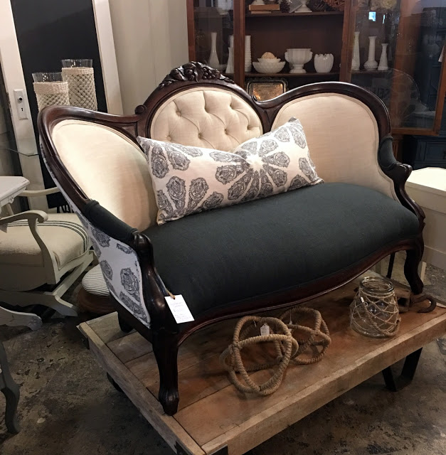
I wanted to do something fun on this piece and give it a more modern feel. I chose cream and charcoal grey faux linen for the front. It has a great texture and is far more durable then linen.
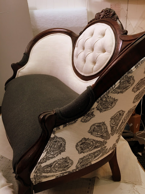
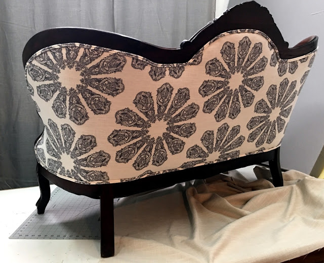
For the back I used a print by John Robshaw for Duralee. I love this pattern. The charcoal on soft white is so pretty and not as jarring as black and white can be. I'm a neutral girl and I typically find that I can live with bold patterns as long as they are in a neutral palate.
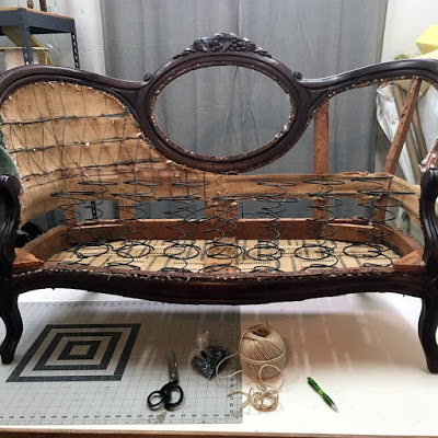
The settee was stripped all the way down and everything replaced. I mostly stick to chairs because I work alone and have limited space so I haven't had the chance to re-tie springs on a piece this large. It was great practice. Tying springs is actually kind of fun, well if you're an upholstery geek like me.
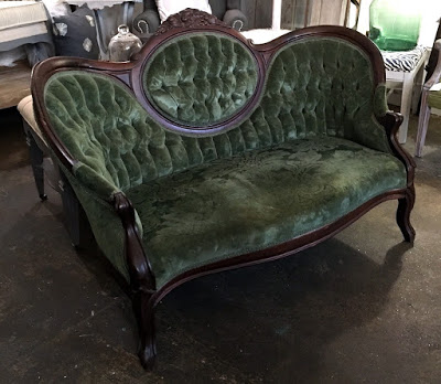
The before was a classic velvet damask. I gave the frame a good scrubbing and restored the finish that was on there. It was just so pretty I didn't want to paint it.
And the after. I chose to only tuft the center cameo section instead of the whole back and used a lot less buttons to update the look. (Although I think it would have been so pretty with the whole back tufted too.) I sewed up a down bolster pillow out of the extra back fabric to tie it all together.
It was a lot of work for a showroom piece but it was something I really wanted to do. A good one for the portfolio. Plus I need samples of my work around so clients can get a feel for my style and this ones definitely a statement piece. Most importantly I need to be able to design and create fun pieces in between custom projects for my own creative sanity.
As for how the Studio is working out it's going great. My Landlords are very supportive and the gal that runs the shop has been so good to work with. I realize now that this idea for my studio could have gone so wrong if I hadn't lucked out with great people. I think why it works is because although we are sharing the same building we each have our own business and we respect each others space. If you remember I share a space with an art gallery, antique vendors and two local artists. For the most part customers have loved the unusual mix. There truly is something for everyone. Inevitably I have had a few people tell me that they didn't think it was the right place for my business. Three people to be exact. I decided instead of getting upset I would ask them why and what they thought I should be doing. They all pretty much said the same thing. You need to be in your own store and have it be full of Home Decor stuff in a perfect location, in a bigger town. Fancier. My response to that is nope that is not what I want right now. I want to have a place to work, showcase some of the pieces I've designed and to work with clients to transform their own furniture into something they love. Throw in a few home decor and re-purposed items because they make it look pretty. That's what I want it to be. I did make one change that someone suggested which was to get a proper table for clients to sit and look at fabrics at. That required me to rent more showroom space which helped give me a bigger presence in the store and actually worked out great.
Whenever I start thinking Bigger, Better, More I try to bring myself back to why I do this and what makes me happy. There are going to be a few changes coming up but for the most part it is working for me and my clients have been so amazing.
-Michelle
